Fu Kah Deng
Game Design Portfolio

The Last Breath
The Last Breath is a game based on a historic battle that happened here in Singapore, known as the Battle of Bukit Chandu.
My role in the making of this game was being the Game Designer, Creative Director, Sound Designer and UI Designer. Storyboarding, User Interface, Art Style, Gameplay, Mechanics and Sound were all designed by me.
You may play The Last Breath here:


The Creative Process
The Last Breath was my first project whereby I thought of User Interface(UI). Starting with the basics, I first tackled the main menu.
Following what I had learned previously in my Graphics Communication module during Common Foundation, I applied the rule of third, as well as some really basic gridwork.
To the right of this paragraph is one of the later iterations of the main menu.
To the left is the finalised Main Menu.
As the project progressed, we learned more and more about User Interfaces, like how main menus nowadays required some form of animation, so the user knows if the game has crashed or not. It also makes it more interesting to look at, rather than a boring image.
In the finalised design, we removed the red backlash as seen in the image above, and instead used it as animation, to provide the user with feedback, to make it look and feel more responsive.
We also added leaves that would fall from the tree as background animation, to give it more life.
User Interface
Level Design
The Last Breath was also my first project whereby I thought of Level Design. Doing a lot of research, I quickly chalked up a level that was semi-accurate to the actual events.
To the right is the first ever mockup of our level design.
As the project progressed, we playtested and realised that as a game, having the player attack from two sides might be too difficult, as our intended audience was young kids who could learn about this historic battle in Singapore.
As such, we adjusted it such that enemies would come from just the left, so it was easier.
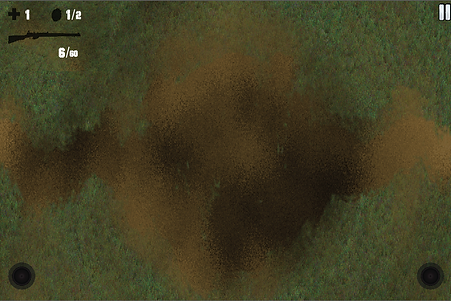
On the right is one of the earlier mockups for the Game User Interface (GUI). As it was designed for the mobile platform, we added in joysticks.
In the beginning, we were going for a very cartoony, Endless War-esque artstyle, thus the really cartoony graphics with the bold outlines.
After our first critique session, we decided to push ourselves and go for more complex artwork (as complex as a 2D top-down shooter could get, for new students like myself when this project was being done.)
On the left is the finalised User Interface for our game. The resolution is that of an iPad Mini, which was the device we had on hand.
We toyed around with the controls a lot, and after lots of testing, discovered that the size of the joysticks as shown in the image to the left is optimal for players, just the right size between comfort and on-screen size.
The challenge here was that it couldn't be too big such that it would cover gameplay visuals, but not too small otherwise it would be uncomfortable to control.
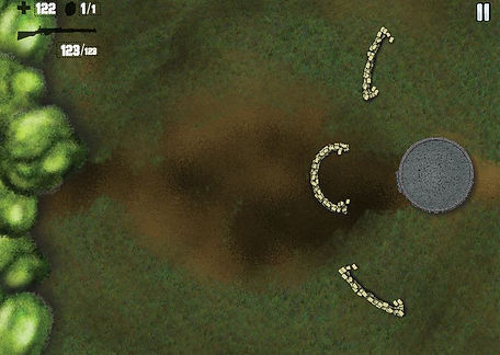

However, we kept the original idea of having the bunker to the right, and packaged it as endless mode instead.
This was catered to the more hardcore, challenge-seeking players who loved games like Dark Souls. It got progressively more difficult, and it is testament to how Lt. Adnan Saidi fought to the very end.
It is very similar to the ending of Halo:Reach, where the Spartan was left to fend on his own from endless waves of Covenant enemies.